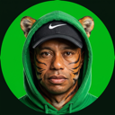
 Tiger Hoods
Avatars
Two directions, both built on the same joke your references run on — the celebrity keeps his face, the body becomes the literal thing the name says. For us that thing is a car hood. Every one below is square and crops clean to a circle.
My picks: Hood + hoodie for the avatar, the green target for the mark.
Hood + hoodie is the one that works exactly like Adam Sander and Sydney Squeegee do — plain white, one object, no scene to decode, and it gets both meanings of the word into a single picture. The green target is the better actual logo: one bold shape, fills the frame, and it survives being shrunk to a favicon, which none of the photographic ones do.
SET A — THE PRODUCT SHOTPlain background, one object, instant read.
The direct analogue of your second reference grid. Nothing to work out — you see a car hood with his face in it and the name lands on its own. The first two are the hood with a hoodie on him, so both meanings of the word are in one picture.
SET C — TWENTY HOODSEvery hood at once.
The name taken completely literally. The green target is the one I would use as the actual mark — it is one bold shape, it fills the frame, and it still works shrunk to a favicon, which none of the photographic ones do.
SET B — THE FORECOURTSame character, shot like the parking lot picture.
Your first reference: flash-lit, wet asphalt, deadpan, played completely straight. These are stronger as posts than as avatars — the detail gets lost once it is a circle.